01
Multiple Customer Journeys
Home brewers, café customers, wholesale buyers, and event clients each needed a clear route through the website.

 Client Project 07
BRAWNANDBRAINS × PRIKTON
Client Project 07
BRAWNANDBRAINS × PRIKTON
Brawn & Brains Coffee is a Singapore-based specialty coffee roaster serving home brewers, cafés, offices, and events. We created a structured ecommerce experience that brings its coffee, café ordering, subscriptions, and wholesale services together.
BRAWNANDBRAINS.SG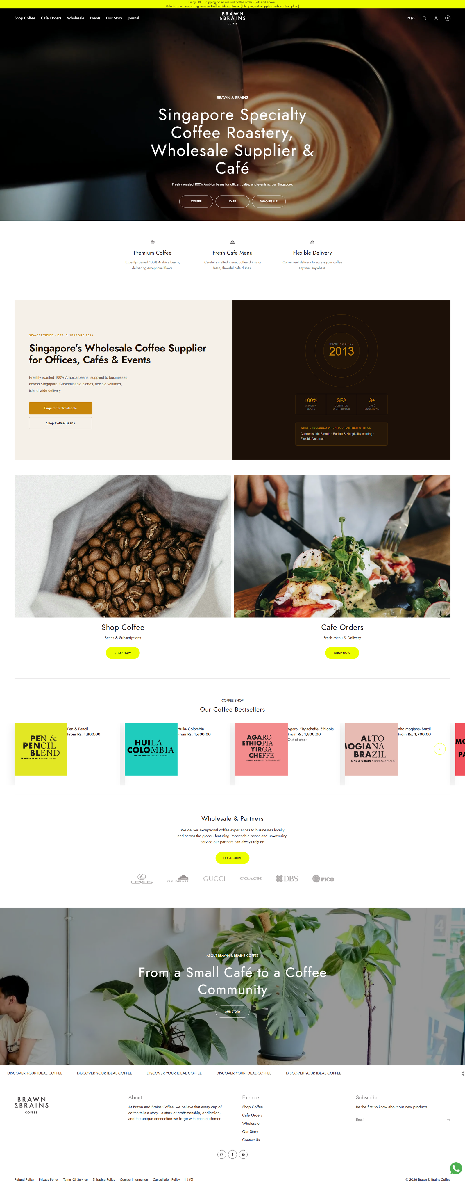
Brawn & Brains needed more than a visual update. Its Shopify store had to serve several customer groups while keeping the experience clear and consistent.
We organised the website around its core services, including roasted coffee, café orders, subscriptions, wholesale supply, and events. The result is a stronger digital home for a growing Singapore coffee brand.
The website contained several types of products and services, but customers needed a clearer path to the right destination. Our goal was to simplify navigation, improve product discovery, and present the brand’s story without losing its warm, independent character.
Home brewers, café customers, wholesale buyers, and event clients each needed a clear route through the website.
Coffee beans from different origins required organised collections and easy-to-read product information.
Typography, colours, images, buttons, and spacing needed to follow one clear visual direction.
We arranged the main services and shopping categories so customers can find the right section quickly.
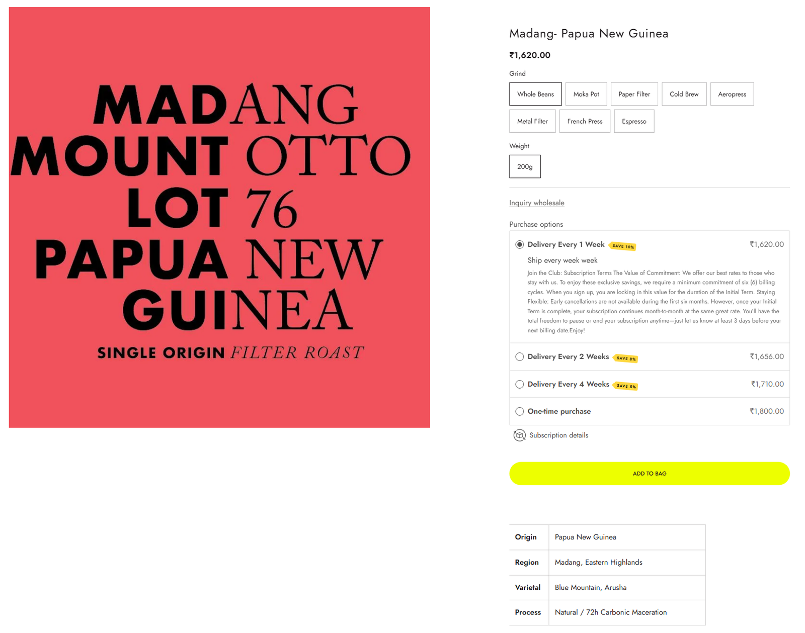
Coffee origin, roast details, available sizes, pricing, and purchase options are presented in a clear order.
Dedicated calls to action make it easier for cafés, offices, and event organisers to contact the business.
Editable Shopify sections allow the team to update products, menus, promotions, and content without changing code.
Use the sections below to pair each important page or feature with a short explanation of why it was designed that way.
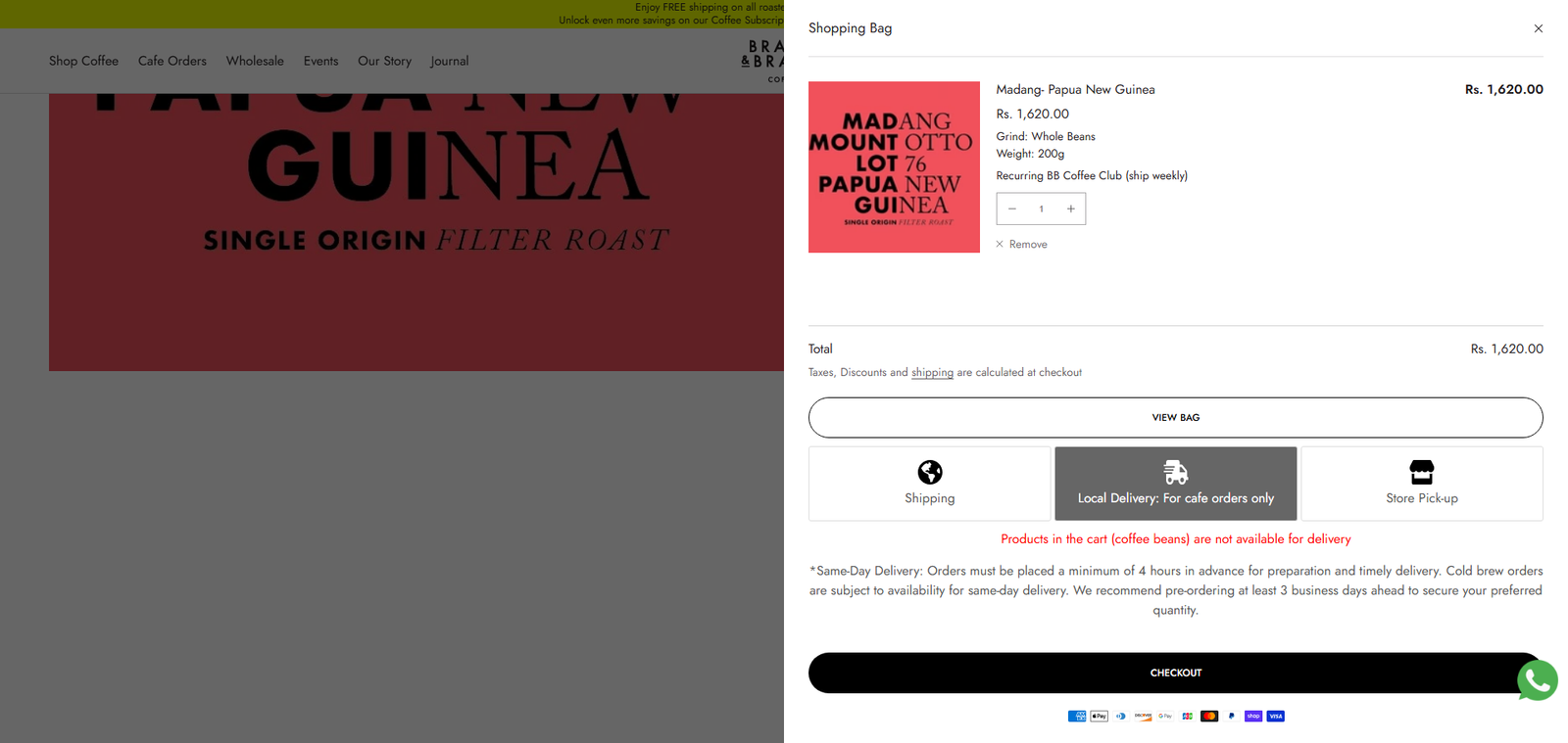
The mobile experience keeps products, café orders, and key information easy to access. Navigation, buttons, product options, and checkout actions are sized and positioned for comfortable use.
We also adjusted content order and spacing so customers can understand each product without moving through crowded sections.
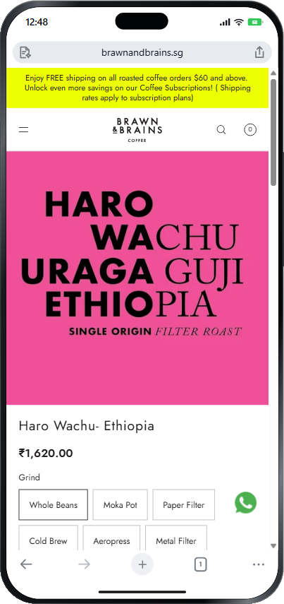
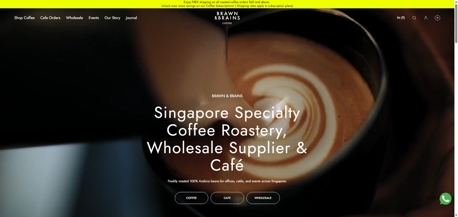
The first screen most customers see—show the hero, navigation and entry points.
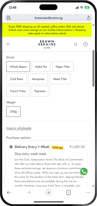
Show how collections, filters and product cards behave on a small screen.
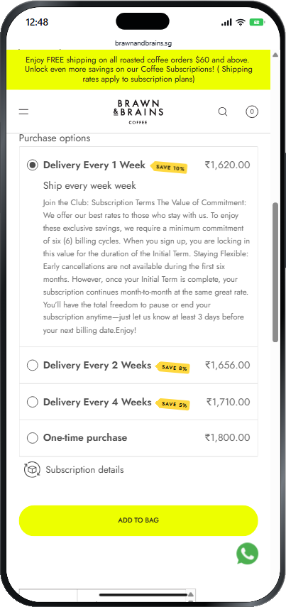
Show how collections, filters and product cards behave on a small screen.
Customers can move directly to coffee shopping, café orders, subscriptions, wholesale services, or events.
Better page structure makes product details and available options easier to understand.
A unified system of colours, typography, imagery, and spacing creates a more polished store.
Every major section was adjusted for a smooth experience across desktop, tablet, and mobile.
Add a genuine client quote describing the problem, Prikton’s process and what became better after launch.