01
Product Organisation
Planners, organisers, inserts, journals and accessories needed clear categories so shoppers could find compatible items more easily.

 Client Project 04
FAYE CO PAPIER × PRIKTON
Client Project 04
FAYE CO PAPIER × PRIKTON
Introduce the client in two or three useful sentences. Explain what the company sells, who it serves, what makes the brand distinctive and why the ecommerce experience mattered to its growth.
FAYECOPAPIER.COM
Faye Co Papier is a women-owned stationery brand offering planners, ring binder organisers, journals, inserts, desk pads, writing accessories and mindful gifts.
The store needed to feel as considered as the products themselves. We developed a Shopify experience that balances soft lifestyle imagery with practical ecommerce features, helping customers find products that suit their routines, goals and personal planning styles.
Faye Co Papier has a broad range of products with different sizes, formats, purposes and personalisation options. Customers needed a simple way to understand those differences.
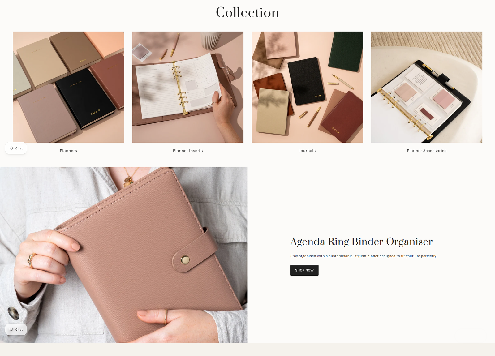
Planners, organisers, inserts, journals and accessories needed clear categories so shoppers could find compatible items more easily.
The store needed to communicate the materials, layouts, uses and thoughtful design behind each product.
Customers needed clear information about available colours, formats and personalisation options before placing an order.
We structured navigation around planners, ring binders, inserts, journals, accessories and gifts.
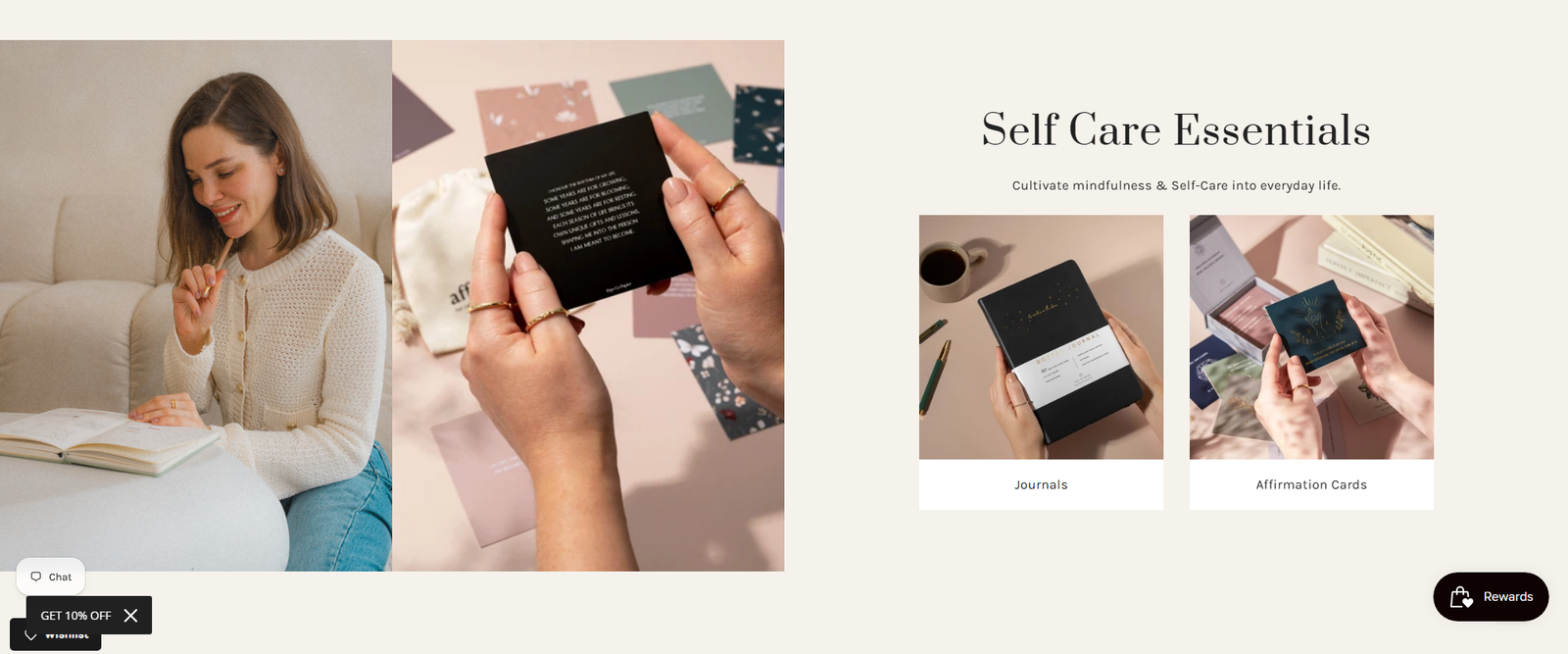
Warm neutral colours, refined typography and lifestyle photography reflect the tactile and personal nature of the products.
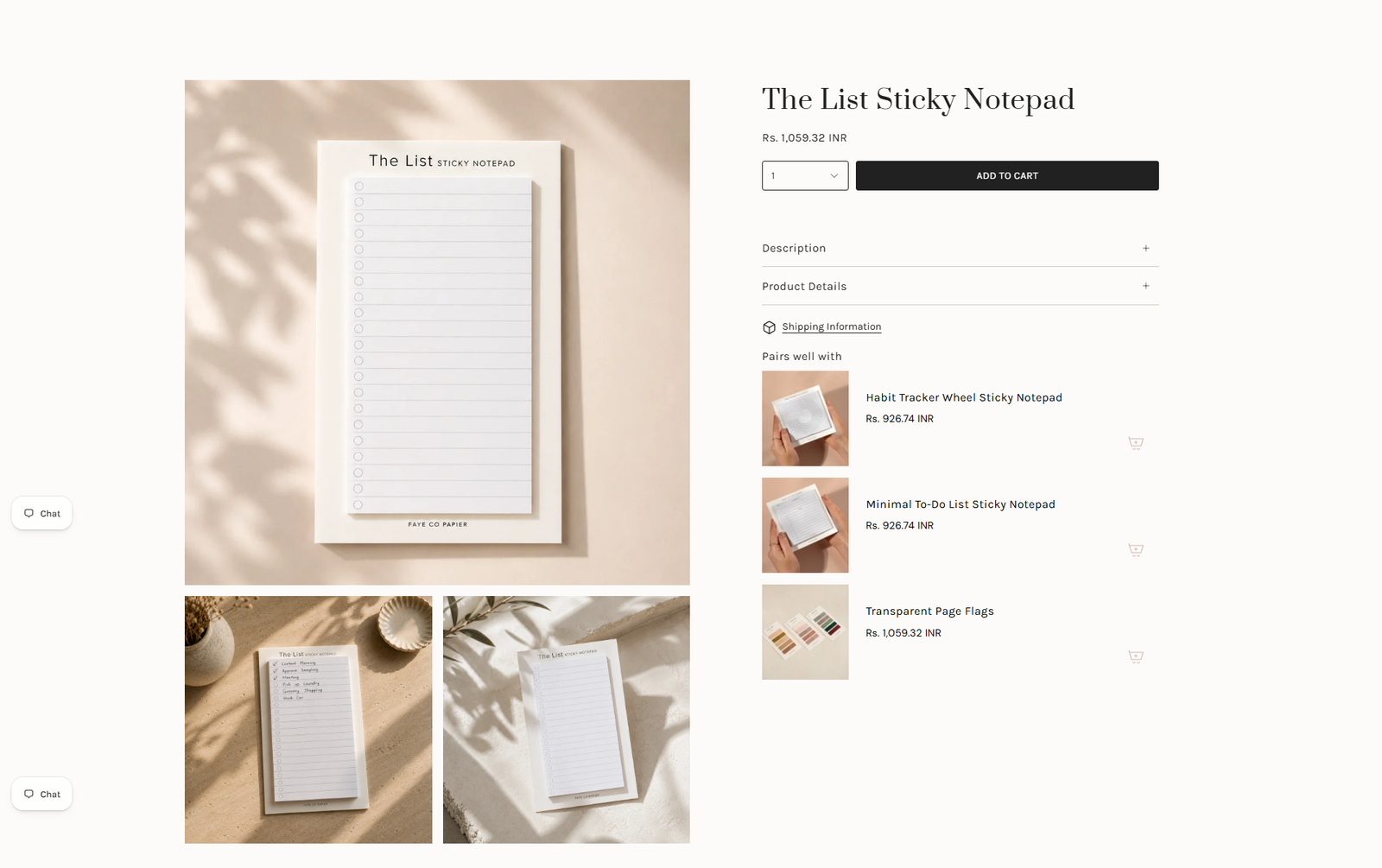
Product pages bring together available formats, colours, specifications, personalisation options and purchasing controls.
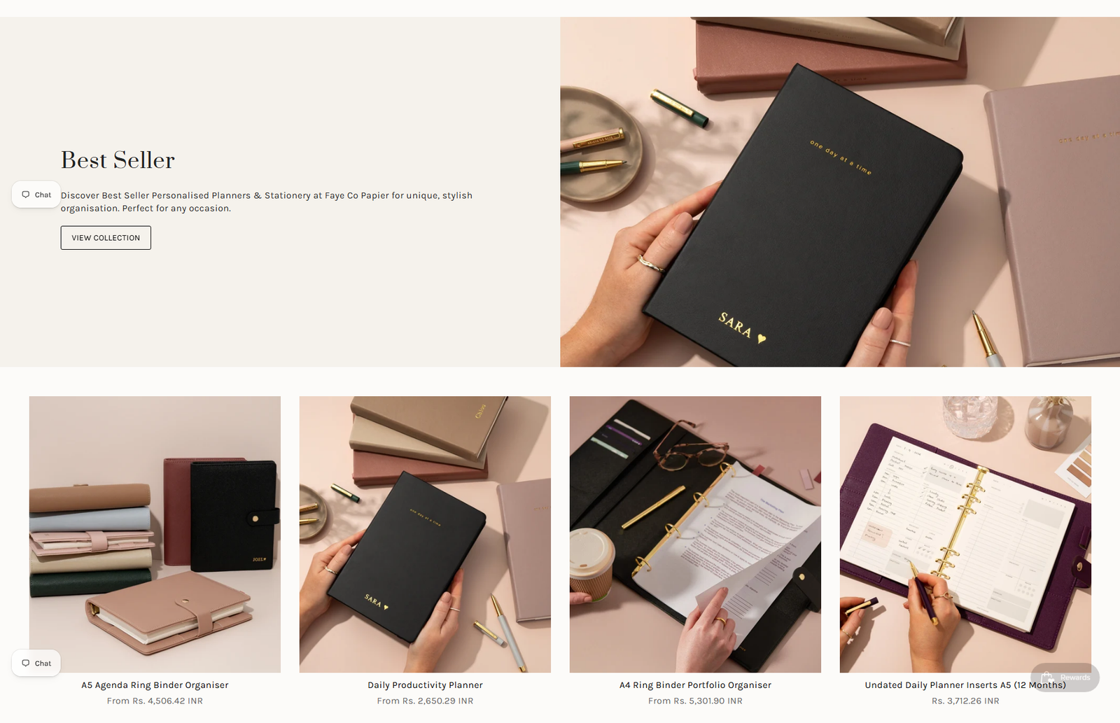
Related collections and complementary products help customers build a complete planning system.
Every layout was adapted to provide a consistent shopping experience across desktop, tablet and mobile.
The finished website uses warm imagery, generous spacing and a soft colour palette to create an inviting experience. Products remain the main focus, while the design supports the brand’s message of organised, productive and mindful living.
The mobile experience keeps the store visually calm while giving customers quick access to products, options and purchasing controls.
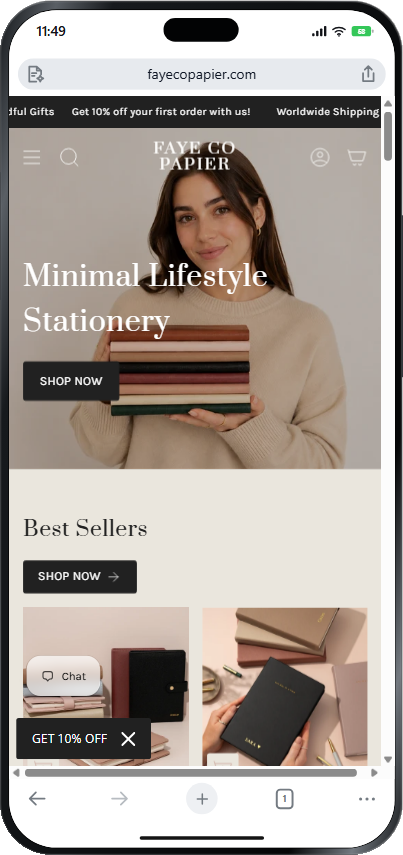
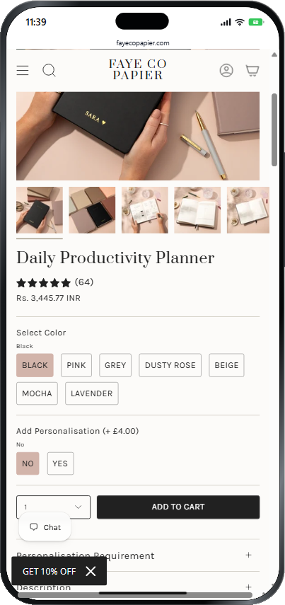
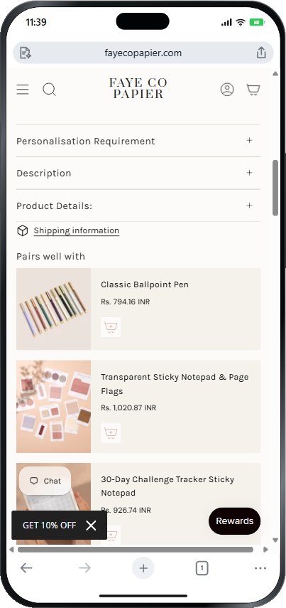
Customers can browse the catalogue through distinct product and lifestyle categories.
The visual system reflects the brand’s calm, thoughtful and design-conscious personality.
Formats, materials, uses and available options are presented in a more structured way.
The main discovery, personalisation and purchasing features remain accessible on smaller screens.
Thank you so much for hardwork, effort & time. Our website looks beautiful. Went above and beyond for everything.