
To optimize Shopify images, resize and compress each file before uploading, choose the right format, serve responsive image sizes, lazy-load offscreen images, and load the main hero image immediately.
Shopify already delivers images through its CDN and can automatically serve modern formats such as WebP or AVIF to supported browsers. However, it cannot fully fix oversized files, poor theme code, heavy sliders, or incorrect loading settings.
Here is how I optimize Shopify images without making product photos blurry.
Check Your Current Shopify Image Performance
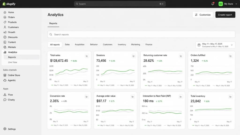
Measure your store before changing anything. Otherwise, you will not know which changes worked.
Start with these Shopify pages:
- Homepage
- Popular collection
- Best-selling product
- Image-heavy blog post
- Main advertising landing page
Go to:
Shopify admin → Online Store
Review the performance metric summary for Largest Contentful Paint, Interaction to Next Paint, and Cumulative Layout Shift.
For more detailed reports, use:
Shopify admin → Analytics → Reports
Search for:
- Largest Contentful Paint
- Interaction to Next Paint
- Cumulative Layout Shift
Shopify’s reports use data from real visitors. The data can take up to 36 hours to update, so do not expect immediate changes after replacing an image. You can learn more from Shopify’s web performance reports guide.
You should also test each important URL with Google PageSpeed Insights. Focus on the mobile report and look for warnings such as:
- Improve image delivery
- Properly size images
- Defer offscreen images
- LCP image was lazily loaded
- Image elements do not have explicit dimensions
Google recommends an LCP of 2.5 seconds or less and a CLS score of 0.1 or less. These are based on the 75th percentile of real visits. See Google’s current Core Web Vitals targets.
Use the Right Shopify Image Dimensions
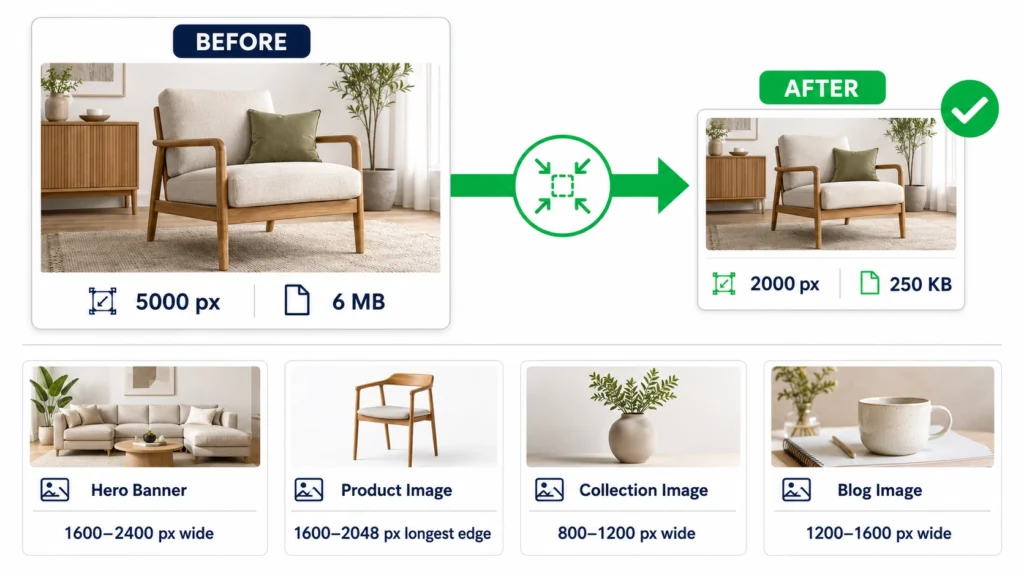
Do not upload a 5000-pixel camera image when it appears only 500 pixels wide on the page.
I use these sizes as practical starting points:
| Image type | Suggested dimensions | File-size target |
| Hero banner | 1600–2400 px wide | Under 300 KB |
| Product image | 1600–2048 px longest edge | Under 200 KB |
| Collection image | 800–1200 px wide | Under 150 KB |
| Blog image | 1200–1600 px wide | Under 200 KB |
| Transparent image | 1200–2000 px wide | Under 400 KB |
| Small logo or icon | Based on display size | Under 50 KB |
These are working targets, not Shopify limits. A detailed product image may need a larger file to keep its texture clear.
Always check how the image looks at its largest displayed size. The smallest acceptable file is the one that loads quickly but still looks sharp.
Keep Image Ratios Consistent
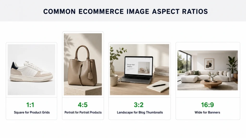
Use the same aspect ratio for images displayed together.
For example:
- Product grids: 1:1
- Portrait products: 4:5
- Blog thumbnails: 3:2
- Wide banners: 16:9
Consistent ratios stop product cards from appearing uneven and reduce unexpected cropping.
To check your theme’s image settings, go to:
Shopify admin → Online Store → Edit theme
Open the product grid, collection, or image section. Look for options such as:
- Image ratio
- Square
- Portrait
- Adapt to image
- Image fit
- Crop position
The exact names depend on your theme.
Choose the Correct Image Format
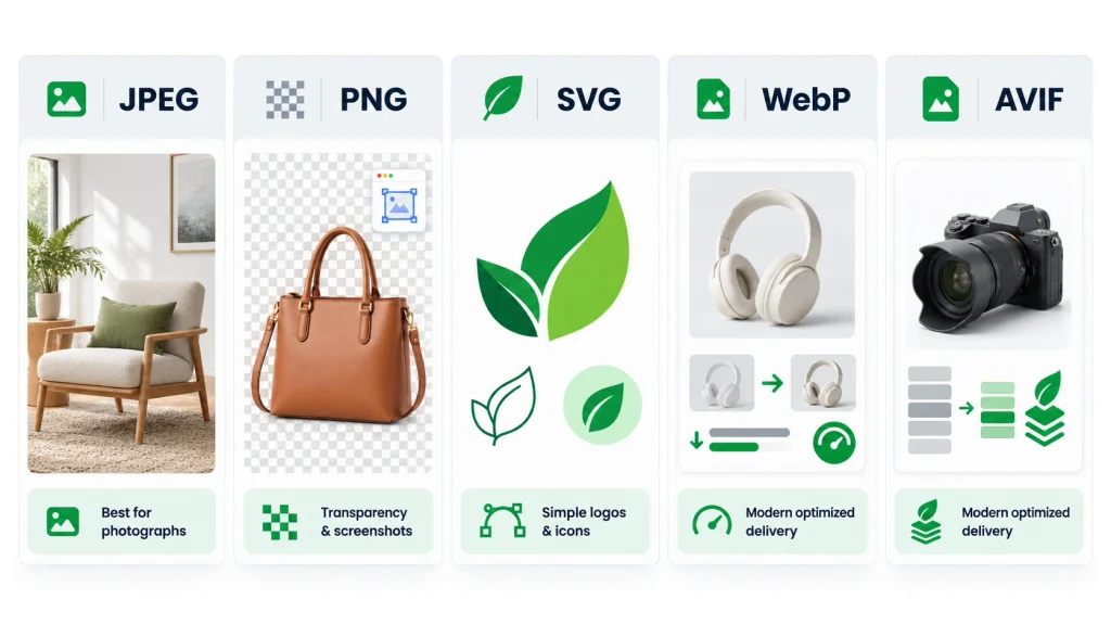
The best format depends on what the image contains.
Use JPEG for photographs
JPEG is usually the best choice for:
- Product photos
- Lifestyle images
- Collection banners
- Blog photography
- Homepage hero images
Export photographs at roughly 70% to 85% quality. Inspect the result at full size before uploading it.
Use PNG only when needed
PNG works well for:
- Transparent backgrounds
- Screenshots
- Graphics with small text
- Images that require lossless detail
Do not save normal product photographs as PNG. The result can be much larger than a similar JPEG.
Use SVG for simple graphics
SVG may work well for logos and simple icons because it stays sharp at different sizes. Only upload SVG files from a trusted source because they can contain active code.
Let Shopify deliver modern formats
Shopify automatically chooses a suitable delivery format. Supported browsers may receive WebP or AVIF even if you uploaded a JPEG or PNG.
You do not need to convert every photograph to WebP yourself. A properly resized and compressed JPEG is often a reliable source file. Shopify explains its automatic format delivery in its image upload documentation.
Compress Images Before Uploading
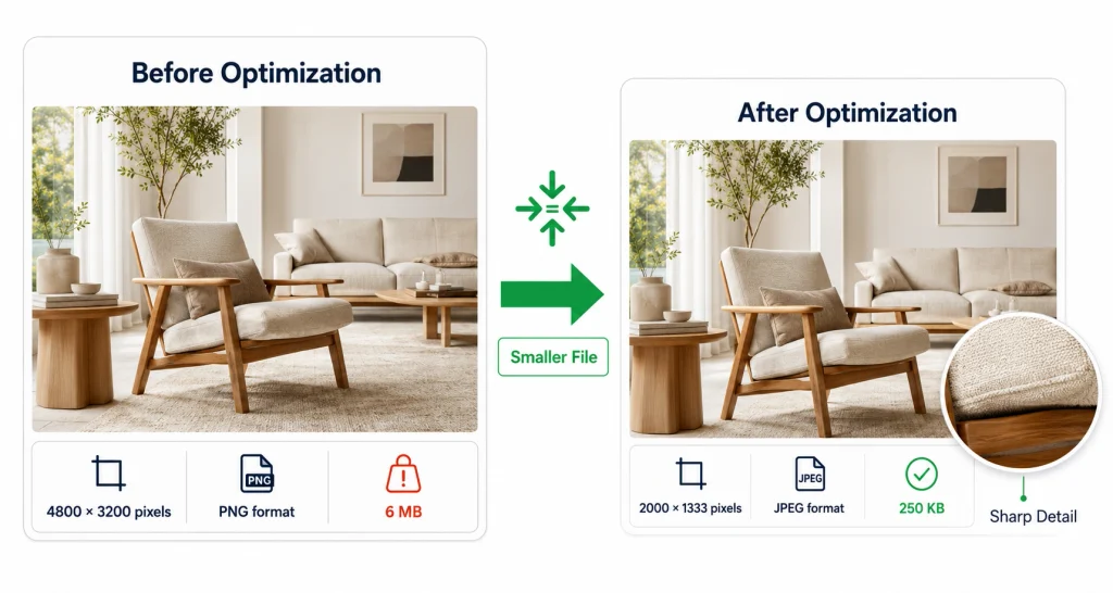
Shopify may apply its own image processing, but I still compress every source image before uploading it.
Follow this order:
- Crop the image to the required ratio.
- Resize it to suitable dimensions.
- Export it as JPEG or PNG.
- Compress the exported file.
- Inspect it at 100% zoom.
- Upload the approved version.
Check product edges, fabric texture, skin tones, gradients, shadows, and any small text.
For example, a homepage banner may begin as:
- 4800 × 3200 pixels
- PNG
- 6 MB
After optimization, it might become:
- 2000 × 1333 pixels
- JPEG
- 250 KB
The exact reduction will depend on the colors and detail in the image. Never repeatedly compress an already compressed file. Return to the original when you need another version.
Replace Images in the Correct Shopify Area
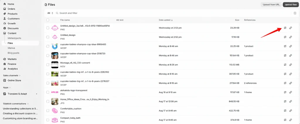
Uploading a new image to Shopify does not automatically replace the old one everywhere.
Replace product images
Go to:
Shopify admin → Products → Select a product
Then:
- Upload the optimized image in the Media section.
- Move it to the correct position.
- Check its variant assignment.
- Add descriptive alt text.
- Remove the old image after checking the new one.
- Click Save.
Be careful with color or style variants. Removing the original too early can leave a variant with the wrong image.
Replace collection images
Go to:
Shopify admin → Products → Collections → Select a collection
Upload the optimized collection image and save the changes.
Replace theme images
Go to:
Shopify admin → Online Store → Edit theme
Choose the correct template and open the relevant banner, slideshow, image-with-text, or featured collection section.
Replace the file, check both desktop and mobile previews, and click Save.
You can manage uploaded files from:
Shopify admin → Content → Files
Do not delete an old file until you confirm that no page or theme section still uses it.
Serve Responsive Images
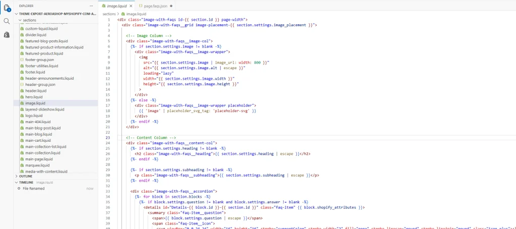
A responsive image setup allows a phone to download a smaller image than a desktop computer.
Shopify recommends using srcset and sizes with its Liquid image filters. Without these attributes, mobile users may download a large desktop image.
A custom product image may use:
{{
product.featured_image
| image_url: width: 1600
| image_tag:
widths: ‘360, 540, 720, 960, 1200, 1600’,
sizes: ‘(min-width: 990px) 50vw, 100vw’,
loading: ‘lazy’,
alt: product.title
}}
The widths setting gives the browser several files to choose from. The sizes setting explains how wide the image will appear in the layout.
The correct values depend on your theme. Do not paste this code into every section without checking the design. Shopify provides more detail in its responsive image guide.
Before editing code, duplicate your theme:
Shopify admin → Online Store → Themes → Three-dot menu → Duplicate
To access the code:
Shopify admin → Online Store → Themes → Three-dot menu → Edit code
Make changes to the duplicate theme and test them before publishing.
Lazy-Load Only Offscreen Images
Lazy loading delays an image until the visitor scrolls near it.
Use it for:
- Product cards below the first screen
- Blog images farther down the page
- Product recommendations
- Footer images
- Gallery images not immediately visible
Do not lazy-load your main hero or first visible product image. This image is often the Largest Contentful Paint element. Delaying it can make your LCP score worse.
Shopify directly recommends that themes never lazy-load the LCP image.
A main hero image may use:
{{
section.settings.image
| image_url: width: 2000
| image_tag:
widths: ‘750, 1100, 1500, 2000’,
sizes: ‘100vw’,
loading: ‘eager’,
fetchpriority: ‘high’
}}
Use fetchpriority=”high” for only the main LCP image. If several images have high priority, the browser cannot make a useful loading decision.
Prevent Layout Shifts
Images can cause content to jump when their dimensions are missing. The browser does not know how much space to reserve until the file arrives.
Shopify’s image_tag filter automatically adds width and height values. For manually written HTML, include both:
<img
src=”product-image.jpg”
width=”800″
height=”1000″
alt=”Blue linen summer shirt”
>
Use responsive CSS so it can still resize:
img {
max-width: 100%;
height: auto;
}
Shopify recommends this approach in its guide to preventing image layout shift.
Simplify Hero Banners and Slideshows
A slideshow may download several large images even though shoppers initially see only one.
For most stores, I prefer:
- One strong hero image
- One short heading
- One clear button
- A separate mobile crop when available
- No automatic video background
If you keep a slideshow, limit the slides and prioritize only the first image. Test the page with the slideshow disabled in a duplicate theme. If the page becomes noticeably faster, replace it with a static banner.
The main hero should preferably use an HTML <img> element instead of a CSS background image. This makes it easier for browsers to discover, prioritize, resize, and reserve space for the file.
Before-and-After Checklist
Before optimization
- Test important URLs on mobile.
- Record LCP and CLS.
- Duplicate the current theme.
- Identify the LCP image.
- Record the largest image files.
- Check whether the hero is lazy-loaded.
- Check whether images have dimensions.
- Save screenshots of important pages.
After optimization
- Check image sharpness on mobile and desktop.
- Confirm product zoom still works.
- Check variant image assignments.
- Confirm banner crops and focal points.
- Retest the same URLs.
- Confirm the hero loads eagerly.
- Confirm offscreen images load lazily.
- Check for responsive srcset markup.
- Check for broken images.
- Monitor Shopify reports after they update.
Shopify Image Mistakes to Avoid
Avoid these common problems:
- Uploading full camera files without resizing
- Saving every photograph as PNG
- Making product images too small for zoom
- Lazy-loading the main hero image
- Giving every image high fetch priority
- Using wide desktop banners that crop badly on mobile
- Removing images without checking variant assignments
- Installing an optimization app before testing the theme
- Compressing files until products look blurry
- Judging results from one speed test
A perfect PageSpeed score is not the main goal. Google says good Core Web Vitals support page experience, but they do not guarantee top rankings. Focus on a store that loads quickly and remains easy to shop.
Simple Seven-Day Action Plan
Day 1: Test the homepage, product, collection, and blog pages.
Day 2: Resize and compress the homepage hero and other above-the-fold images.
Day 3: Optimize images on your most-visited products.
Day 4: Replace large collection and blog images.
Day 5: Check responsive image code, dimensions, and lazy loading.
Day 6: Test sliders, galleries, review apps, and page-builder sections.
Day 7: Retest the original URLs and monitor real-user performance.
Start with pages receiving the most traffic. Optimizing your whole catalog first can waste time if only a few templates are causing the main problem.
FAQs
Does Shopify automatically optimize images?
Shopify uses CDN delivery, image processing, and automatic format selection. You should still resize and compress source files and confirm that your theme requests responsive sizes.
What is the best format for Shopify images?
Use JPEG for most photographs, PNG for transparency, and trusted SVG files for simple logos or icons.
What file size should a product image be?
I aim for under 200 KB when the product remains sharp. Detailed or transparent images may need a larger file.
Should every Shopify image use lazy loading?
No. Lazy-load offscreen images, but load the main hero or likely LCP image immediately.
How long do performance results take to update?
PageSpeed Insights can show lab changes immediately. Shopify’s real-user reports may take up to 36 hours to reflect new data.