01
Brand Personality
The experience needed to feel warm, playful and outdoor-ready without distracting customers from the products.

 Client Project 06
OTIS & I × PRIKTON
Client Project 06
OTIS & I × PRIKTON
We developed a colourful Shopify experience that brings Otis & I’s handcrafted dog leads, harnesses and brand story together in one friendly, easy-to-shop storefront.
OTISANDI.COM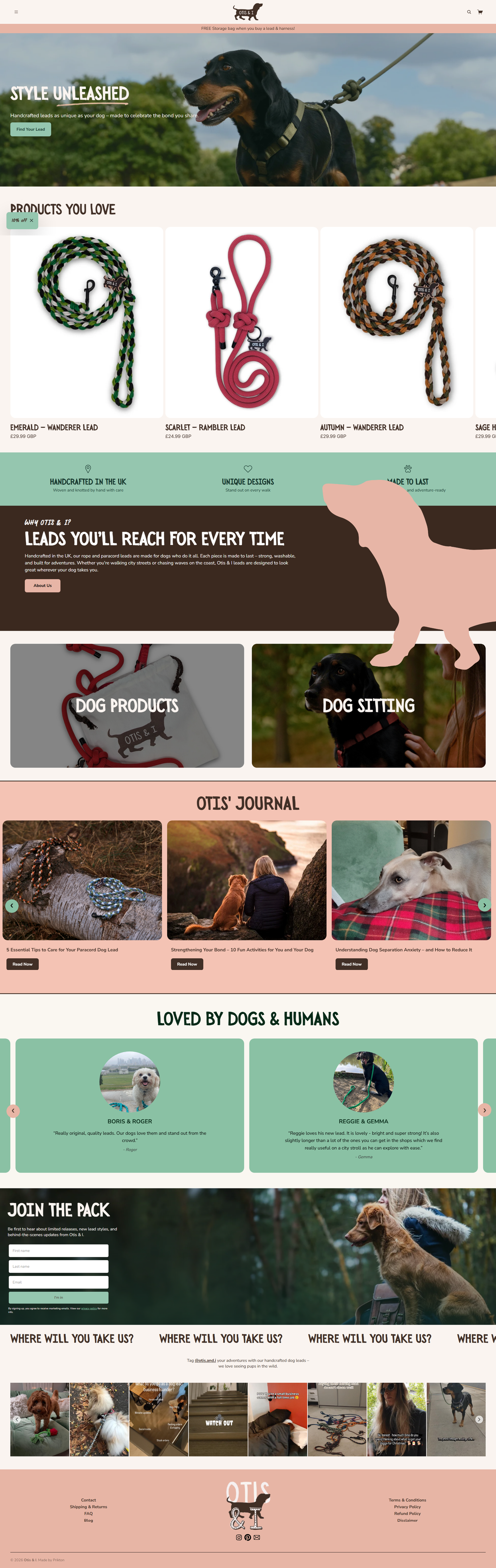
Otis & I is a UK pet-accessories brand inspired by the connection between dogs and their owners. Its handcrafted rope and paracord leads combine distinctive colours with durable, washable construction.
We developed a Shopify store that captures the brand’s playful personality while giving customers a clear way to browse leads, harnesses and supporting content.
The store needed to do more than display pet products. It had to communicate the handmade quality, practical construction and personality behind every design.
The experience needed to feel warm, playful and outdoor-ready without distracting customers from the products.
Customers needed clear information about lead styles, colours, materials, sizes and suitable uses.
The product catalogue and purchasing controls needed to remain easy to use for customers shopping from their phones.
We created direct shopping routes for dog leads, harnesses and the complete product range.
Warm colours, dog photography and playful graphic elements give the store a recognisable personality.
Product pages bring together images, pricing, available options, product details and purchasing controls.
The About page, Otis’ Journal and dog-sitting content give customers more reasons to connect with the business.
Every page was adapted to provide a consistent experience across desktop, tablet and mobile screens.
The finished storefront combines playful colours, outdoor photography and simple product layouts. It feels personal and energetic while allowing the handmade products to remain the main focus.
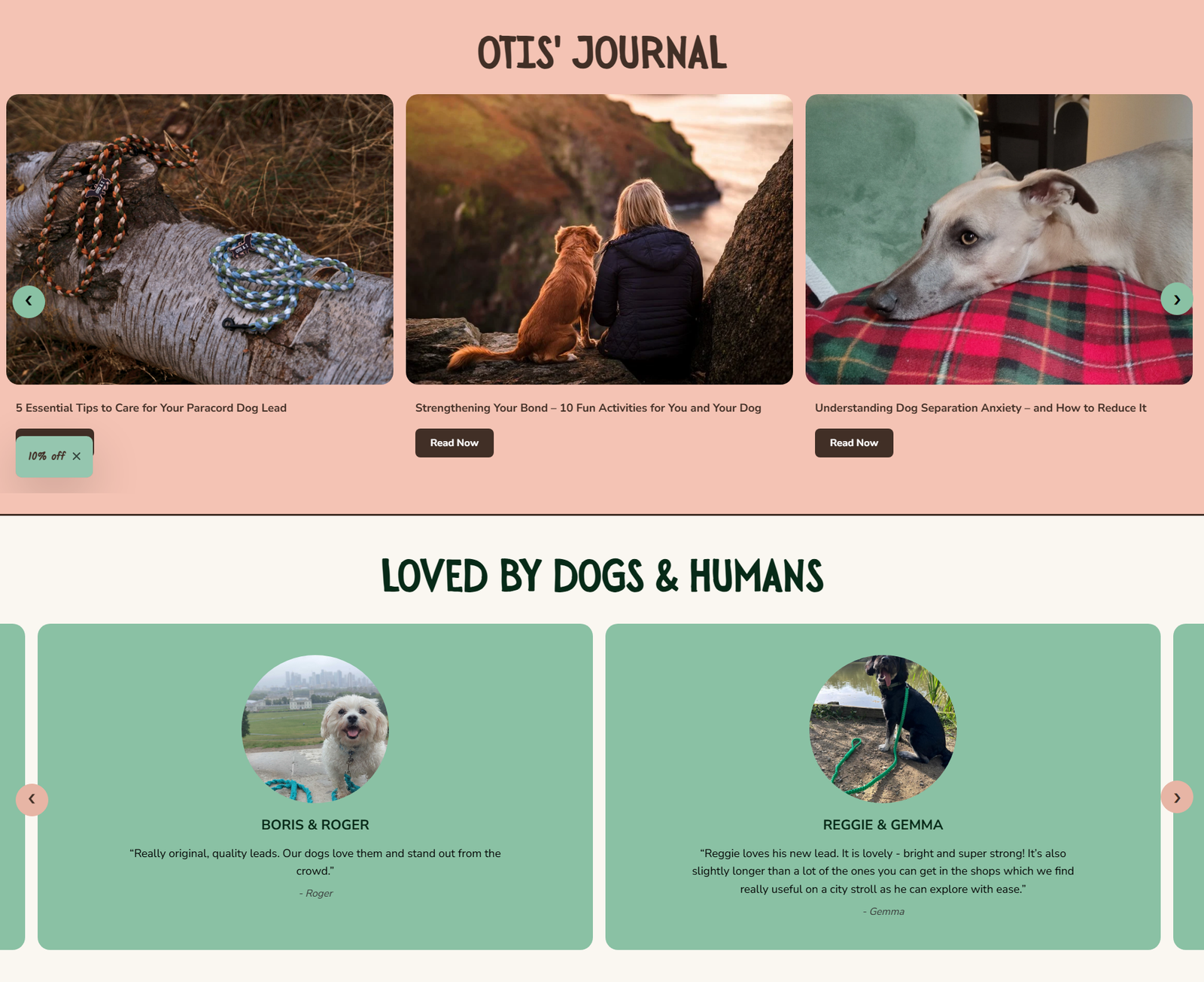
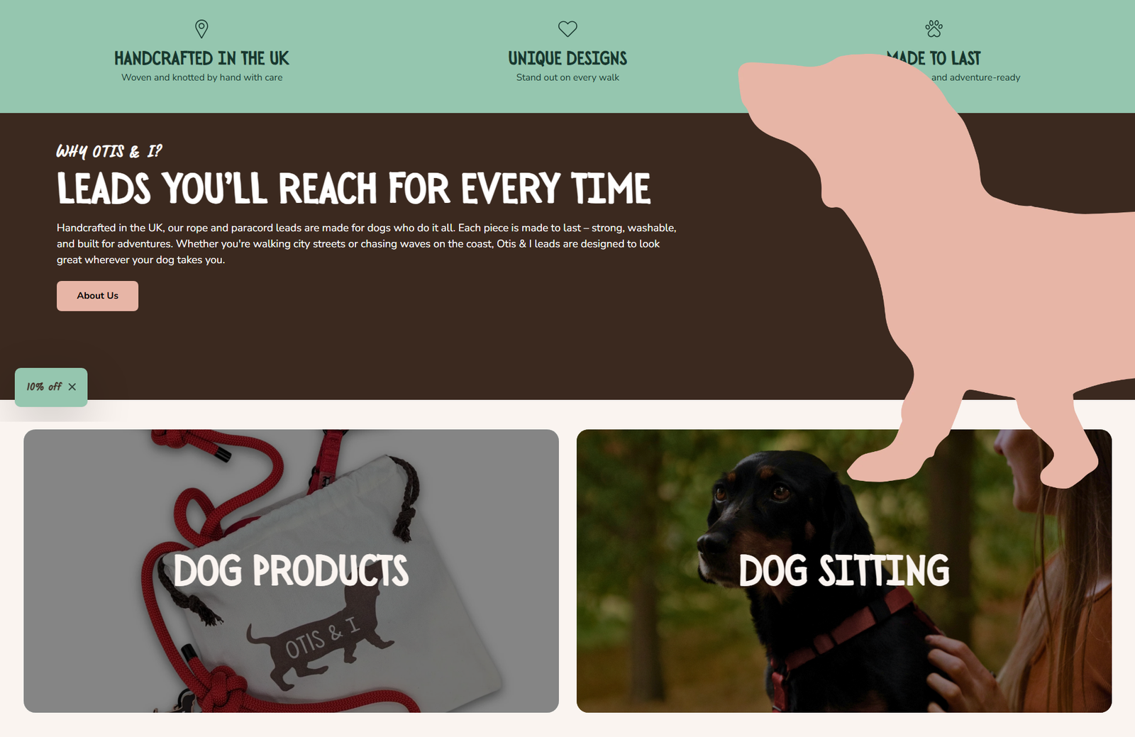
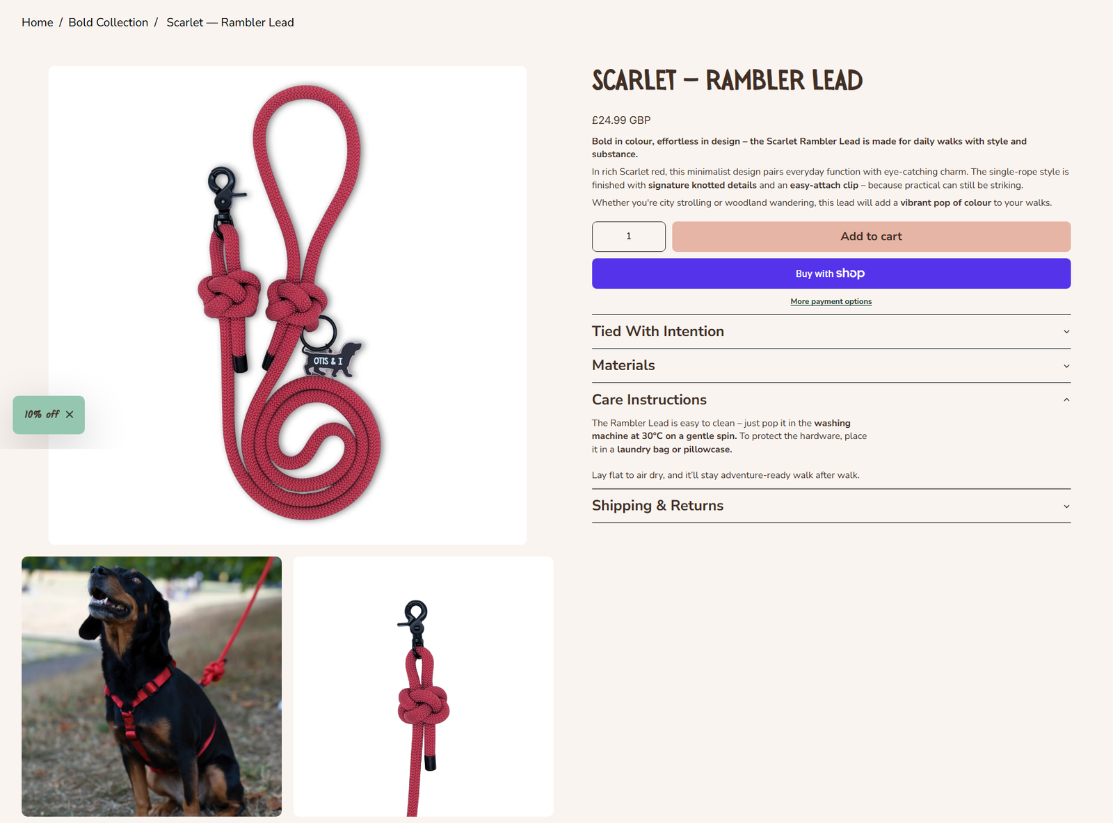
The mobile storefront allows customers to browse products, compare designs and place an order wherever their next walk takes them.
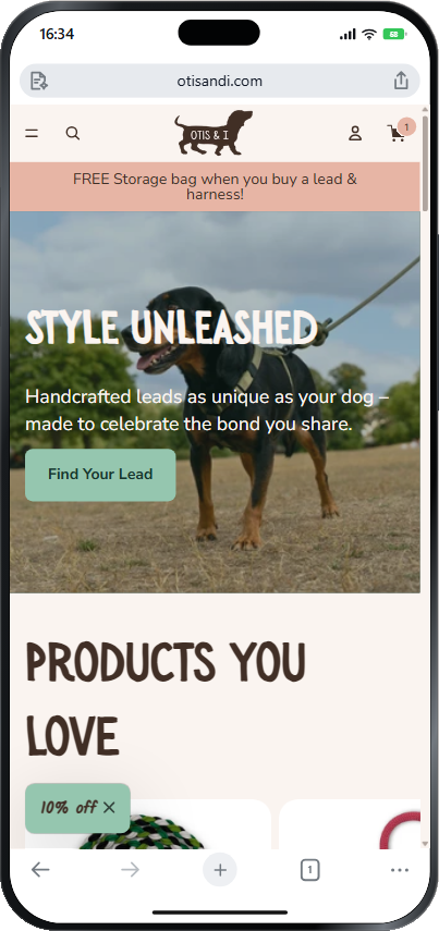
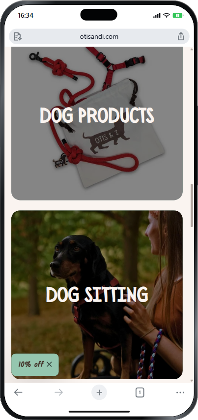
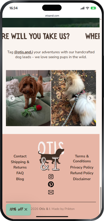

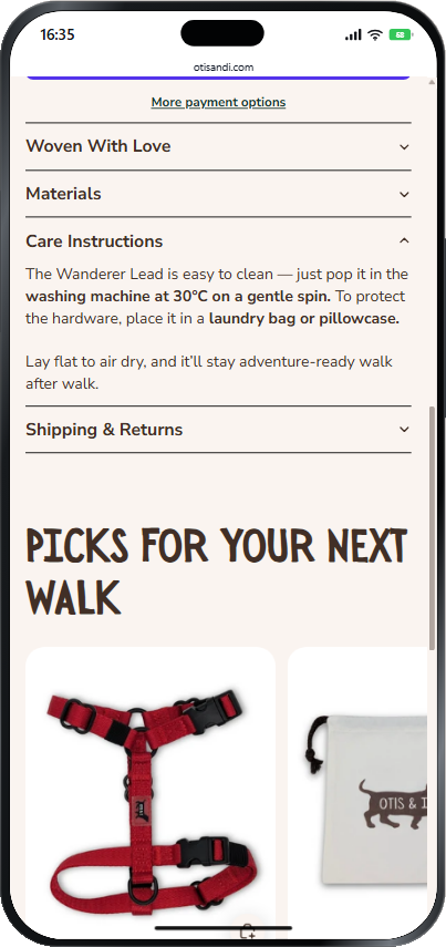
Colour, imagery and typography create a storefront that feels recognisably Otis & I.
Customers can move directly between handcrafted leads, harnesses and the complete collection.
Images, materials, colours, product benefits and buying options are presented in a more structured way.
The same playful identity and essential ecommerce features carry across all screen sizes.
Subhajit has demonstrated exceptional professionalism in website maintenance, delivering results that exceed expectations. The team quick responsiveness, deep understanding, and proactive communication make working with him a seamless experience.